I redesigned how thousands of law firms track their serves.
Proof handles service of process: the constitutional requirement that someone must be formally notified when they're sued. Our platform connects thousands of law firms with a nationwide network of process servers. These serves often involve urgent, emotionally charged cases where uncertainty quickly erodes trust. I led the redesign of our client-facing experience — the company's largest product initiative — partnering with product and engineering leadership to set strategy while staying hands-on in the craft.
Why it mattered
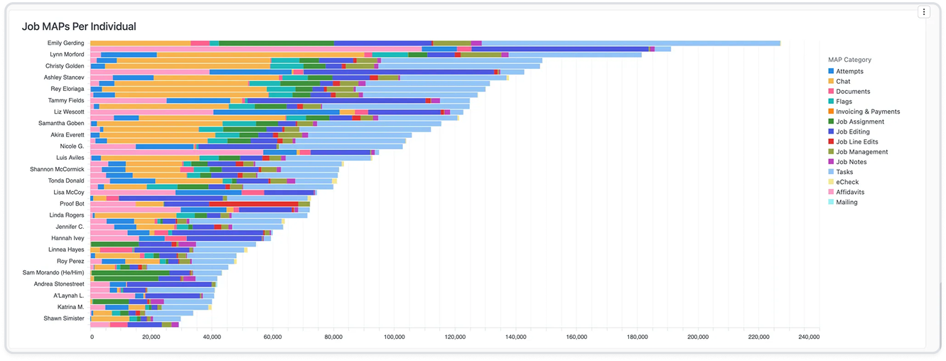
The job details page hadn't been touched in years.
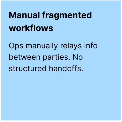
We knew it needed work, but it was a big undertaking with lots of stakeholders and opinions. We agreed to take a phased approach, starting with one widget: chat.
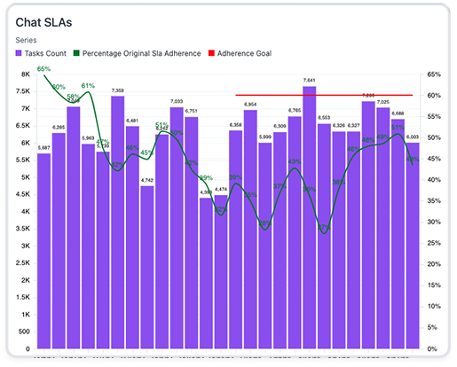
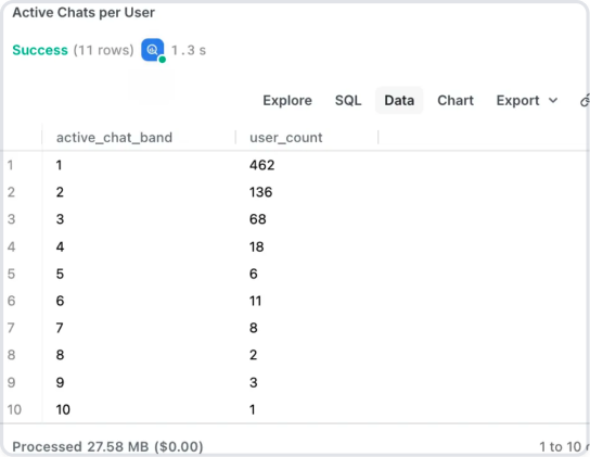
Chat is a key differentiator. Clients can message process servers directly. But every message creates a review task for ops. The business goal was to reduce task volume. The design question: why are clients chatting so much?
The issue wasn't chat. It was clarity.
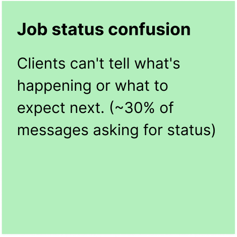
I used Claude to classify 1,000+ chat threads by intent, identifying 16 distinct message categories. The pattern was clear…clients weren't chatting because they wanted to chat. They were asking the same question over and over: what's happening with my job?
The problem wasn't the chat experience. It was that we weren't telling clients what they needed to know.


“People are dealing with some of the most traumatic experiences they'll ever have. A divorce, a child custody dispute, somebody's taken off with the kid. The more information we can give them, the more reassuring it is to them that things are moving in the direction they need them to go.”
— Paralegal, mid-sized family law firm
But clarity alone wouldn't solve it.
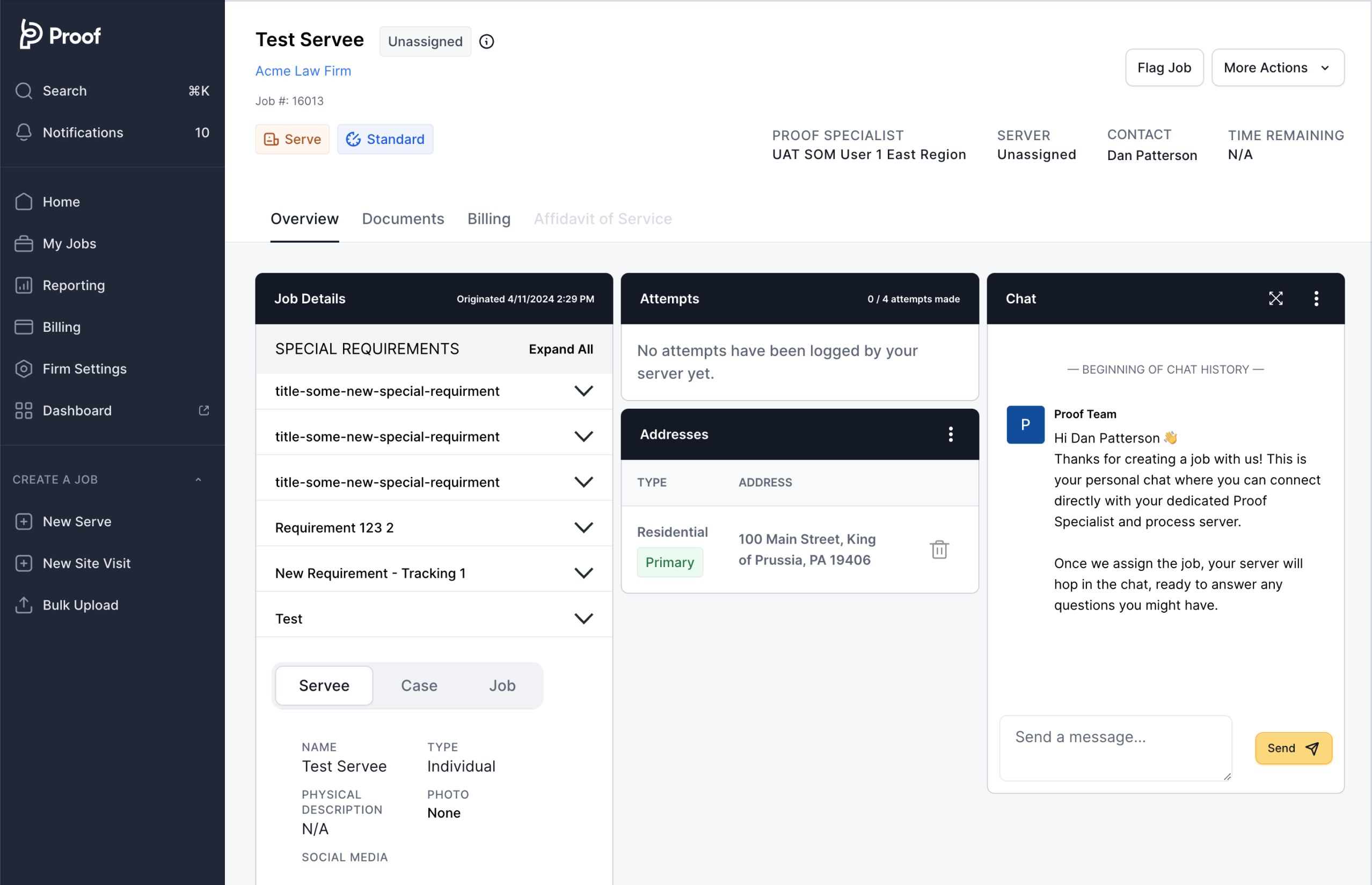
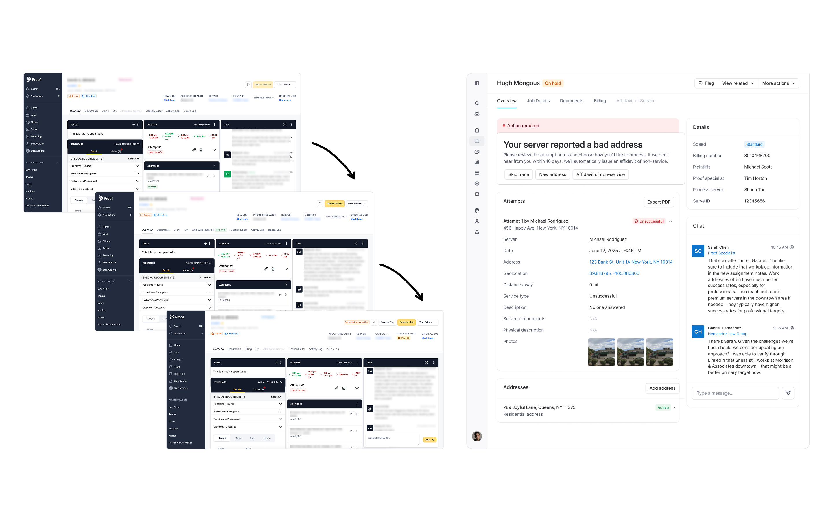
When jobs get redispatched (natural disasters, server availability, access issues, client requests) our system created a brand new page. New job. New chat. New history. Clients with complex serves had 2–10 separate job pages to navigate. Which one was current? Where should they message?
That's not a product experience. That's a breakdown of trust.
One serve, one story.
“Jobs” were an internal concept that made sense for ops but meant nothing to clients. We needed a new mental model: one serve, one story, regardless of how many reassignments happened behind the scenes. The serve became the container.
Three experiences that remove uncertainty.
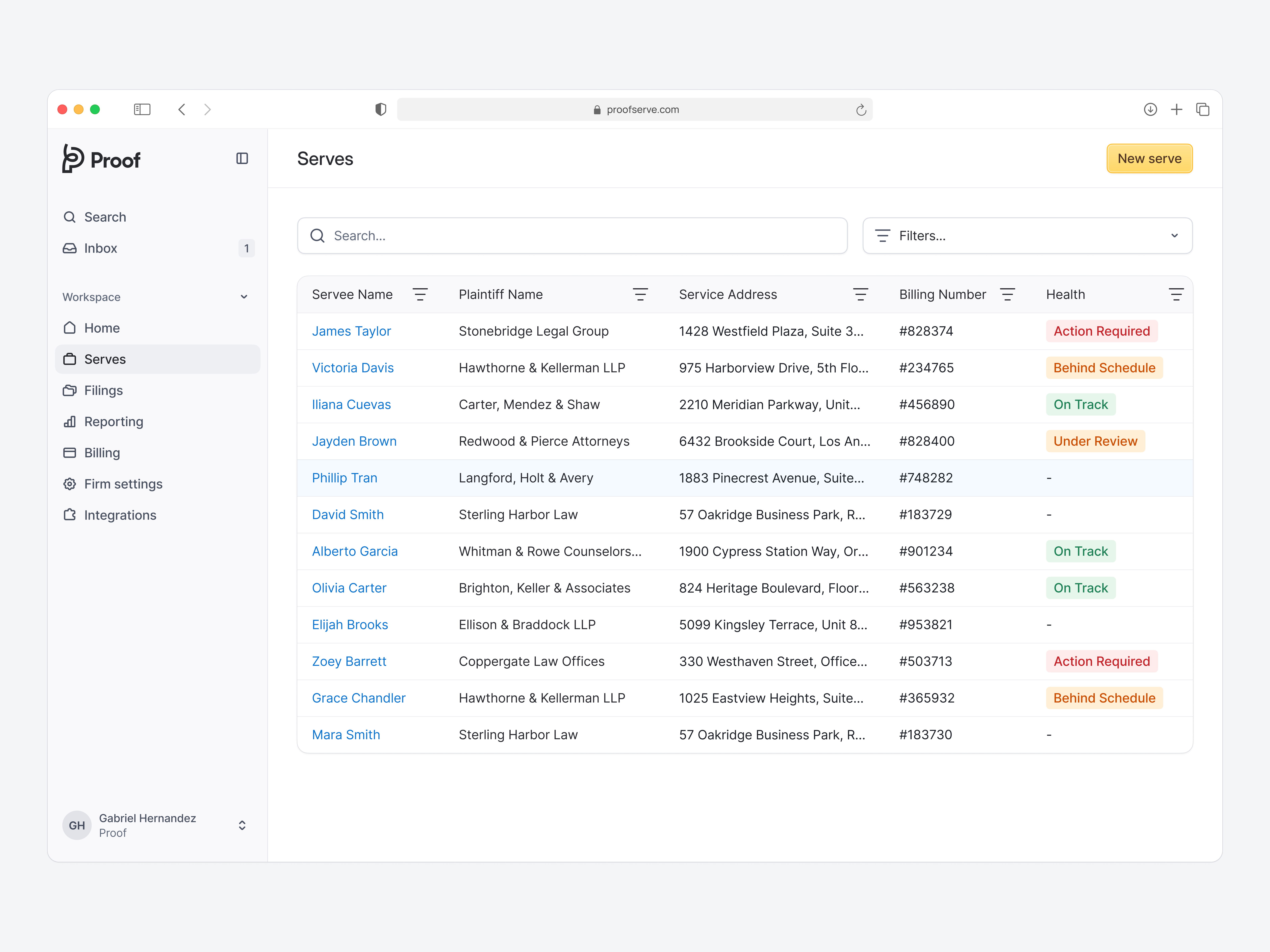
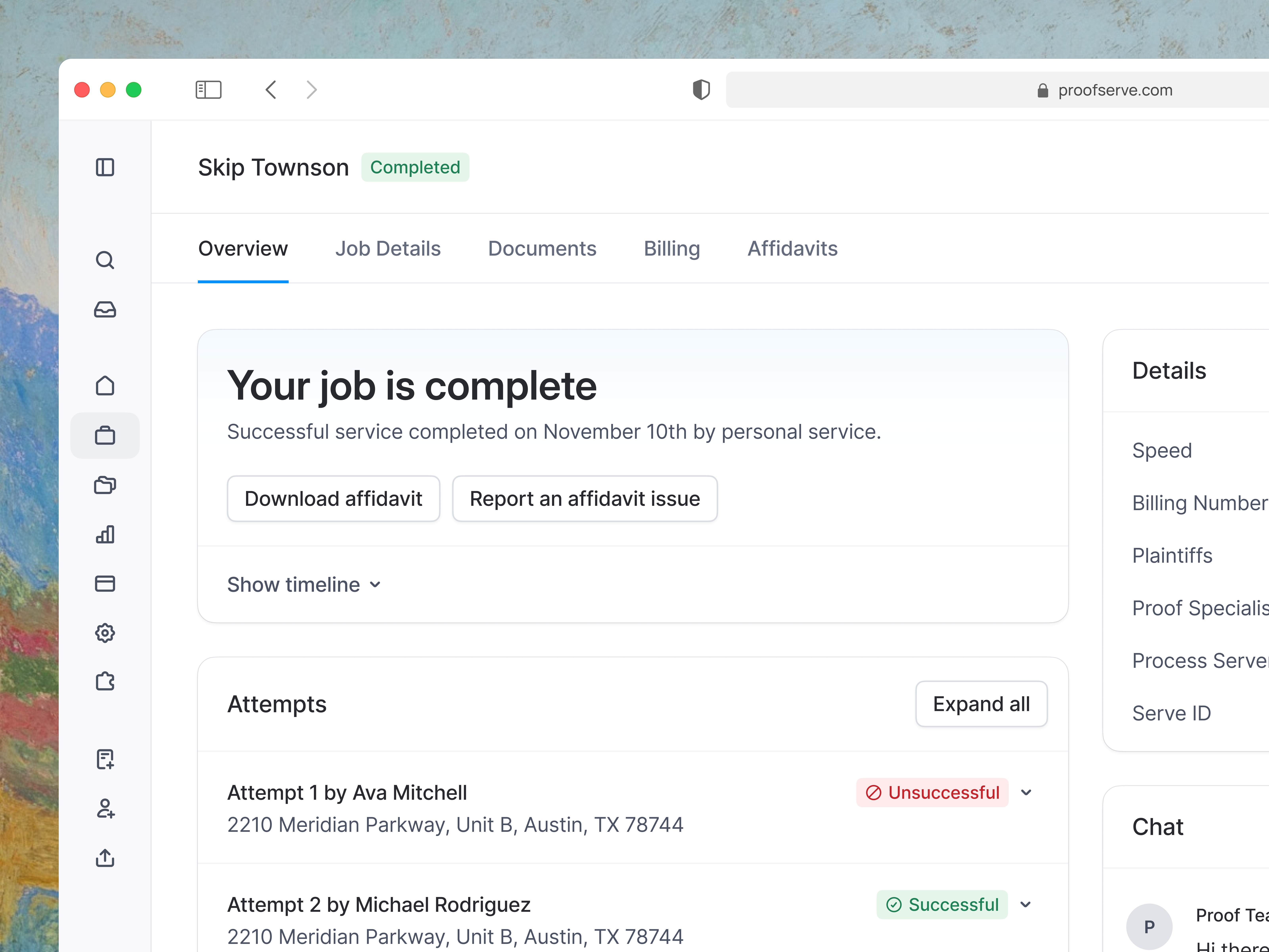
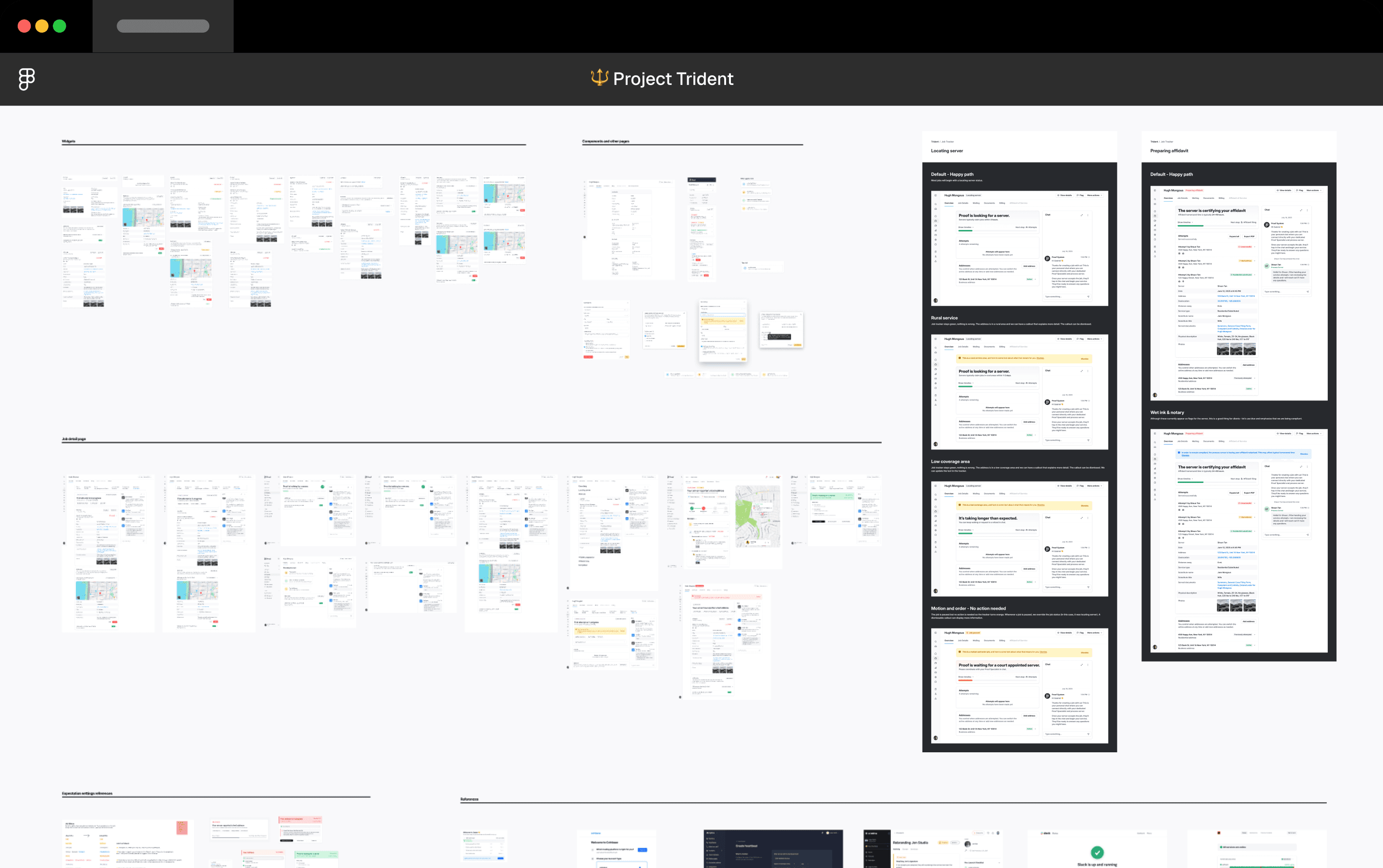
Answers one question: is this progressing the way it should? Instead of binary status labels, it surfaces contextual health indicators (on track, needs attention, at risk) and explains why. Attempts count in aggregate across the full serve. Risk surfaces early, not after failure.
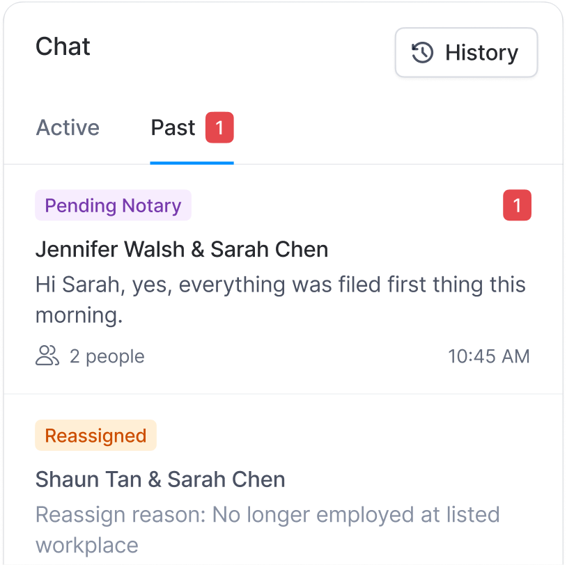
Reassignments no longer reset the conversation. A single timeline preserves all attempts, chats, and documents regardless of how many times the serve changes hands.
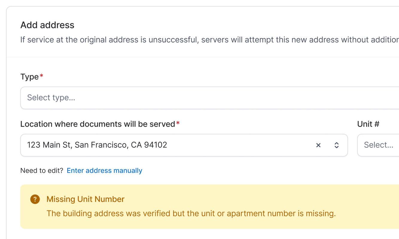
Many failed attempts came from address quality issues. We integrated Melissa Data to validate addresses proactively and surface risks before dispatch.
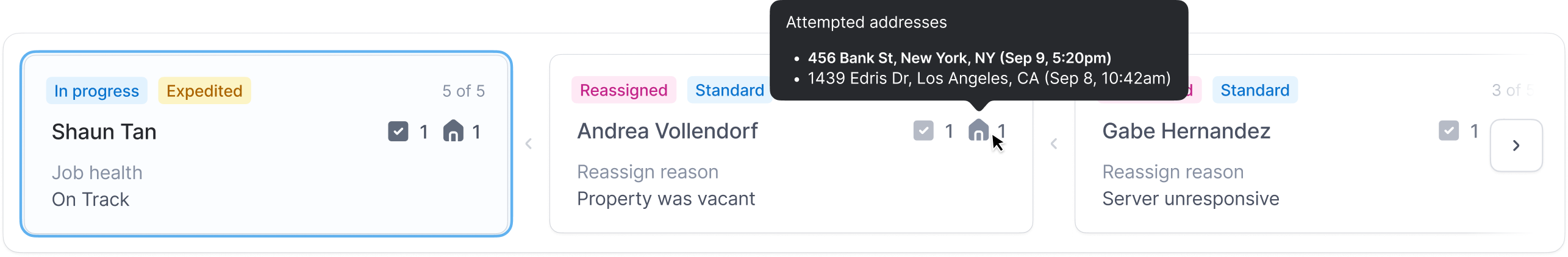
Enabling ops without rebuilding the platform.
Client visibility required ops to see the same unified context. Stakeholders proposed redesigning the entire ops platform.
I recommended a narrower approach: a global job selector that surfaces key context without changing existing workflows. Ship value now, defer the full redesign.
“Thank you for listening to our feedback and keeping the workflow very similar while also adding value with information in ways that we can go self-serve it and not confuse the team. Taking our feedback and doing what you did, it's a world of efforts, and it's very much appreciated.”
— VP of Operations
Measurable results, visible trust.
Building it together.
I partnered closely with engineering to define the data model, edge cases, and interaction behavior, reviewing implementations for fidelity and feasibility. I worked with the PM to pressure-test scope, sequence work, and decide what not to build — prioritizing clarity and adoption over feature breadth.
And I collaborated closely with my amazing design team; defining the system-level approach, setting design direction, making scope and sequencing decisions, and ensuring the final experience shipped as a coherent, end-to-end system.
Led structural design and iteration across complex states. Owned the job tracker structure, status variants, and edge-case exploration, as well as the chat experience.
Owned the detailed UI work across the experience, including component styling, borders, shadows, hover and focus states, spacing, and typographic refinement.
Clients didn't need more features — they needed to understand what was already happening.
By redesigning the client experience around a continuous story (and enabling internal teams to support that truth), we reduced confusion, restored trust, and created a scalable foundation for retention.